LodgeMaster 4 is built using what's know as "responsive design" in the web design world. This means that the user interface in the page will adapt itself to fit the size of your screen. You can watch it in action in a desktop web browser by resizing your browser window to be very small, and watch how the page reacts as it gets to certain sizes.
Here's a summary of some of the ways the UI changes, to help you find things in the mobile version (or if your browser window is small).
Top navigation bar
I'm using the Member Manager navigation bar for demonstration purposes, but it will work similarly to this on all screens with a top navigation bar.
By default, the top navigation bar in the Member Manager will look like this:

All of the menu items are spelled out with both icons and text descriptions.
As the size of the window gets smaller, the first thing to change is the text descriptions will go away on the main menu items and you'll be left with just the icons:

Since there are so many menu items in the Member Manager, this will probably be the view most people see in their desktop browser by default, unless you have a really big monitor.
You can hover over any of the icons with the mouse pointer to see a tooltip that shows what they are. In mobile, you can tap on any of them to drop them down, and the menu name itself will be on a black background at the top of the menu that pops up.
The next thing to go will be the search box and the account menu, which will both lose their labels and become just icons:

The account menu still behaves as it did.
The search box that was formerly right in the navigation bar will now pop up when you click/tap on the magnifying glass icon.
The next thing to go will be the title of the module you're currently in:

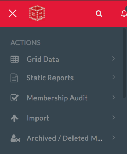
After that, the main menu items in the navigation will disappear from the navigation bar altogether:

But you can still get to them! They just moved out of the top navigation into the side navigation. If you tap on the three bars to the left of the OA LodgeMaster icon, the side navigation menu will appear, and you can now find those items right at the top:
Grid Data
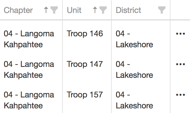
By default, LodgeMaster will show data in grids with all of the columns available and a horizontal scrollbar to see any that are off the screen.
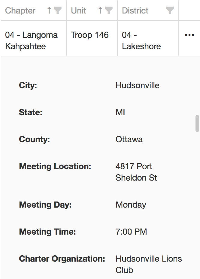
Once the window gets below a certain size, horizontal scrolling gets a bit unwieldy (you would be sliding your finger forever to scroll a column at a time across the grid), so the grid is then collapsed to show only the first one or two columns, as space permits, then a final column on the right-hand edge of the screen with an elipsis (...) in it.
Clicking on the elipsis (...) will drop down a box containing the remaining columns for just that row as a column name and column value pair on each line, which you can scroll up and down.